It’s Wednesday – lets head the to steakhouses!
On the way, let’s take a slight detour past the US Treasury and see how they’re getting along these days. After all, we’re about to elect a new US President – one who will have an impact on future tax rates and budgets – let’s see what the new President will inherit.
And with interest rates at 5,000 year lows, one might expect the Treasury to be rolling in money, experiencing a huge budget surplus right? We’ll see.
As always, if you need a refresher on the SHI, or its objective and methodology, I suggest you open and read the original BLOG: https://terryliebman.wordpress.com/2016/03/02/move-over-big-mac-index-here-comes-the-steak-house-index/)
Why You Should Care: The US BEA publishes GDP figures the instant they’re available. Unfortunately, it is a trailing index. The data is old news; it’s a lagging indicator. I’d sure like to know how the economy is doing in advance of the GDP release, wouldn’t you?
Personal consumption expenditures, or PCE, is the largest component of the GDP. In fact, the majority of all GDP increases (or declines) usually result from consumer spending. Clearly this is an important metric to track.
It’s my hope the SHI can help. I intend the SHI is to be predictive, anticipating where the economy is going – not where it’s been. Thereby giving us the ability to take action early. Not when it’s too late.
Taking action: Keep up with this weekly BLOG update. If the index changes appreciably – either showing massive improvement or significant declines – indicating expanding economic strength or a potential recession, we’ll discuss possible actions at that time.
The BLOG: I throw around some pretty big numbers in my blog. And while the numbers themselves are important, more important is how they relate to, or scale to, other correlated numbers.
For example, as of the end of Q2, the US GDP is $18.45 trillion. (Remember, this number is unadjusted by the ‘deflator’ used to calculate the ‘real’ GDP.) We have the largest GDP on the planet. By comparison, the country in 2nd position – China – has a current GDP of about $11 trillion, or about 60% of ours.
Fiscal 2016 ended September 30th. We’re waiting for actual receipts and spending numbers. According the the US Government Publishing Office (“GPO”), 2016 receipts were expected to equal $3.34 trillion and expendatures were forecasted at $3.95 trillion. Nope, sorry, no surplus. Even with interest rates at 5,000 year lows.
The difference, our deficit, was forecast at about $615 billion. It will actually be a bit less than that…partially attributable to interest rates being a bit lower than forecast.
Let’s make the numbers a bit easier to grasp. Dividing the amount we spent by the current GDP, we find our US government spent about 21% of the GDP. By historic standards, this is about what we spend each year.
Of course, if GDP growth remains muted – as it has been – but US government spending continues to increase, we must borrow more money.
Ever wonder how the Treasury spends its money? Here’s a great graphic courtesy of Haver Analytics:

In the first gray bar, you can see this chart reflects activity over the past 5 fiscal years. The column under each fiscal year reflects the increase or decrease in spending over the prior year. The column under the “% of Total” shows both where money came from and how money is spent.
Note how the ‘deficit’ has declined from 2012 thru 2016? We see the deficit is now running about 3% of GDP. As total spending equals about 21% of GDP, we can see Treasury collections are right around 18% of GDP. This is about normal by historic standards. From above, we see about 47% of collections comes from personal income taxes, about 9% from corporate taxes. Surprising, right? Wouldn’t you expect corporate taxes to be a greater portion of total receipts? Especially when the US has one of the highest corporate tax rates in the developed world? I’ll save this discussion for a future blog.
About 6% of the almost $4 trillion spent was spent on interest. Per the GPO, we will spend $240 billion in fiscal 2016. This may also surprise you, too: Doing some quick math, we find the “average” interest rate paid on all our debt was 1.32%. Pretty low, right? How is this possible? I’ll save this for a future blog as well.
How do we finance this spending? The Treasury uses its credit card. The outstanding balance is public record (http://www.treasurydirect.gov/govt/reports/pd/histdebt/histdebt_histo5.htm):
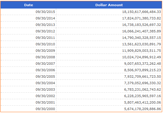
Who owns this debt? Well, this might surprise you a bit:
- About $5 trillion is owned by “Federal Government accounts” such as social security.
- A bit under $2.5 trillion is owned by the FED – part of their QE program.
- Meaning about $10.6 trillion is “owned by the public“
How much of this ‘public debt’ is owned by foreigners? Great question. Here you go:
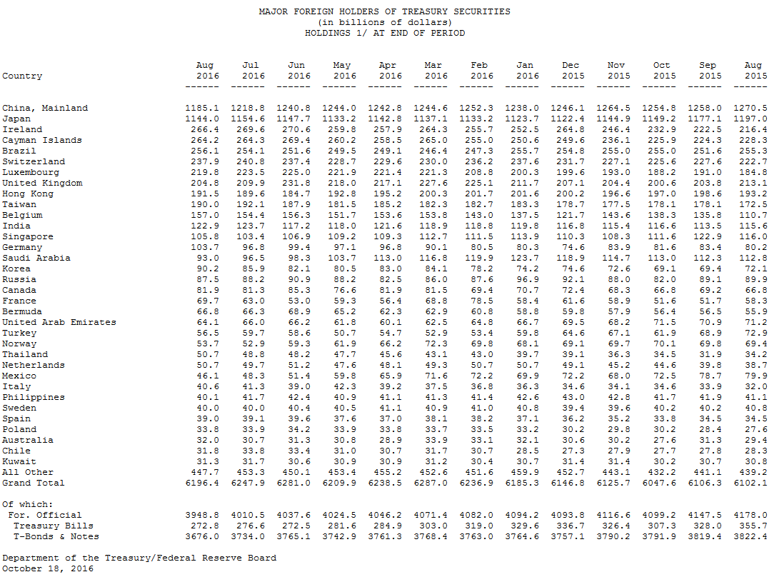
Total foreign holdings are about $6.2 trillion. (http://ticdata.treasury.gov/Publish/mfh.txt) As you may have already know, Japan and China are the largest holders of US debt.
Yes, this is a lot of numbers. Let me summarize a few important points:
- US receipts tend to run around 18-20% of GDP. Spending is running about 3-4% higher than collections.
- Our US debt balance is large. It has doubled in size since the Great Recession.
- With interest rates at 5,000 year lows, our interest rate is only about 1.32%. A 1% increase in the average interest rate will increase the annual interest expense by about $180 million – an amount equal to about 1% of the GDP.
- Which may make you wonder why the FED seems to be in such a hurry to raise interest rates.
All right, I know a bone-in ribeye at Mastros is also a big number – both in cost and 22-oz size – but let’s head over and see how they’re fairing this week.
Big number or not, you’re not sinking your teeth into that bone-in ribeye at Mastros Ocean Club in Newport Beach this Saturday. They’re completely booked – unless you want to go at 9:45 pm. Which I might do if I could sleep at the table after dinner. I’ll pass. God forbid I fall asleep, face down, in the lobster mashed potatoes.
Don’t even ask about The Capital Grille. Here is this week’s SHI chart:
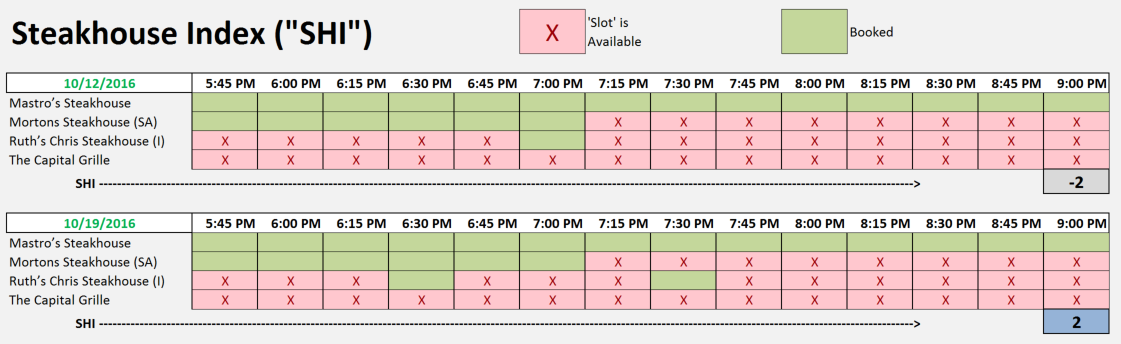
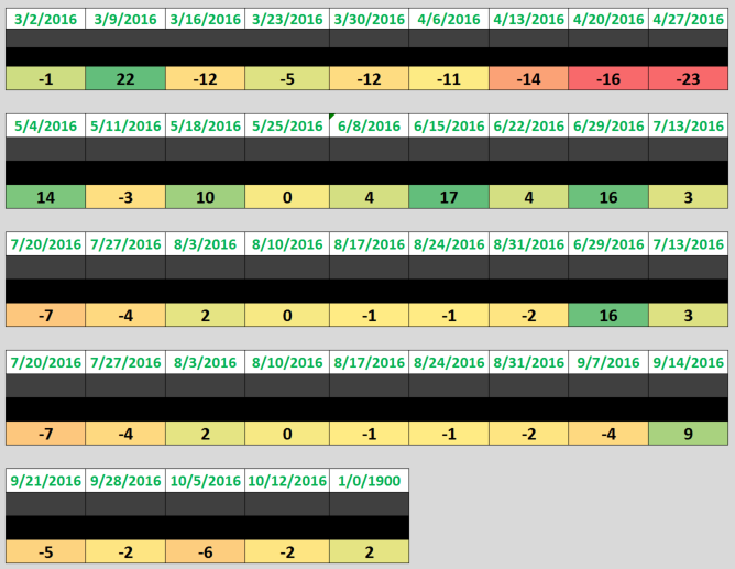
So, week over week, the SHI has moved from a negative (-2) to a positive 2. In the big picture, not a meaningful improvement. It reflects the continuing stability in consumer spending that we’ve been experiencing for the past few months. As you can see in the trend chart below, the SHI has been wavering between a positive 3 and a negative (-7) since mid-July.
Let me finish with this comment.
The FEDs ‘Beige Book‘ was released earlier today. Here is an excerpt from the summary:
“Reports from the twelve Federal Reserve Districts suggest national economic activity continued to expand during the reporting period from late August to early October. Most Districts indicated a modest or moderate pace of expansion….”
Yet again, the SHI seems to tell us pretty much the same thing. By both the FEDs measure, and our SHI, the US economy continues to expand at a moderate pace.


1 Comment
[…] sound good to me. With a national debt already above $18 trillion (review this BLOG post: https://terryliebman.wordpress.com/2016/10/19/the-steak-house-index-shi-update-10192016/), I don’t believe the US can easily support another $15 trillion of debt. And any such move […]