
SHI 2/5/2020 – Sorry About That!

SHI 1.22.20 – When a House is a Bad Investment
January 22, 2020
SHI 2.12.2020 – Ride The Wave!
February 12, 2020
“I apologize for missing last week’s blog post.”
I was hacked! Some unscrupulous hacker — I won’t name names — inserted a virus into my blogsite. All my SHI data was corrupted and I had to rebuild the entire site from scratch! I apologize for missing the Wednesday blog deadline, but rest assured I was as frustrated as you about this breach.
I jest! No, there was no hacker, no virus. Sure, I could blame a mythical hacker. You’d never know the truth, right? But, alas, I cannot. I promised you only the facts. The unvarnished truth. Truth be told: I was out out of town on business and was unable to access the data or my blogsite. Sorry. 🙂
We do have updated GDP data to digest, however! On Thursday, January 30, the ‘Advance Estimate‘ of the Q4 (2019) data was released. I was a little surprised by the number. Let’s take a closer look.
Welcome to this week’s Steak House Index update.
If you are new to my blog, or you need a refresher on the SHI10, or its objective and methodology, I suggest you open and read the original BLOG: https://www.steakhouseindex.com/move-over-big-mac-index-here-comes-the-steak-house-index/
Why You Should Care: The US economy and US dollar are the bedrock of the world’s economy.
But is the US economy expanding or contracting?
According to the IMF (the ‘International Monetary Fund’), the world’s annual GDP is about $85 trillion today. According to the most recent estimate, US ‘current dollar’ GDP now exceeds $21.7 trillion. In Q4 of 2019, first estimates suggest nominal GDP grew by 3.6%, following a 3.5% annualized growth rate in Q3. The US still produces about 25% of global GDP. Other than China — in a distant ‘second place’ at around $13 trillion — the GDP of no other country is close. In fact, the GDP output of the 28 countries of the ‘European Union’ has fallen behind, collectively now almost $2 trillion less that US GDP. Together, the U.S., the EU and China still generate about 70% of the global economic output.
The objective of this blog is singular.
It attempts to predict the direction of our GDP ahead of official economic releases. Historically, ‘personal consumption expenditures,’ or PCE, has been the largest component of US GDP growth — typically about 2/3 of all GDP growth. In fact, the majority of all GDP increases (or declines) usually results from (increases or decreases in) consumer spending. Consumer spending is clearly a critical financial metric. In all likelihood, the most important financial metric. The Steak House Index focuses right here … on the “consumer spending” metric. I intend the SHI10 is to be predictive, anticipating where the economy is going – not where it’s been.
Taking action: Keep up with this weekly BLOG update. Not only will we cover the SHI and SHI10, but we’ll explore related items of economic importance.
If the SHI10 index moves appreciably -– either showing massive improvement or significant declines –- indicating growing economic strength or a potential recession, we’ll discuss possible actions at that time.
The BLOG:
According the to Bureau of Economic Analysis, in Q4, 2019 American GDP grew at the annualized rate of 2.1%, and for the entire year, by 2.3%. Frankly, while the SHI suggested our GDP continued to grow at a reasonable, if not moderate, rate during Q4, I was a bit surprised by the ‘2-handle’ in the figure. I expect the number to come in closer to 1.1 to 1.2%. Here’s how the growth figures for the quarter break down:
- Consumer spending, known as “Personal consumption expenditures,” the historic foundation for GDP growth, added 1.2% to GDP for the quarter. At 57% of the quarter’s total number, it added a bit less than usual, but was quite close to its historic 67%.
- Investment was negative, driven almost entirely by a draw-down in ‘private inventories,’ subtracting growth from the quarter’s GDP figure by 1.08%. You’ll recall that the ‘investment’ component of GDP is responsible for both current GDP growth and future potential growth. The larger the investment, the larger the potential future growth.
- Government spending increased a bit … adding 0.47% to the quarter’s GDP figure.
- The big winner for the quarter: Exports. Net exports grew exceptionally quickly during Q4, due to the fact that imports shrunk at the annualized rate of 8.7% while exports grew a a 1.4% annual rate. As a result, about 70% of the quarter’s GDP growth can be attributed to exports. (Might the tariffs have truncated import activity? Hmmm….)
Is this a good thing? A bad thing? Frankly, it’s neither.
The bottom line is this: The final GDP number is always impacted, one way or the other, by each of these 4 contributing silos. Of course, for decades, consumer spending has been the stalwart anchor of our economy, over time responsible for about 2/3 of all GDP growth. The other three numbers tend to bounce around like a cork on an angry ocean. For example, take a look at the ‘exports’ data in my chart below, created from BEA data:
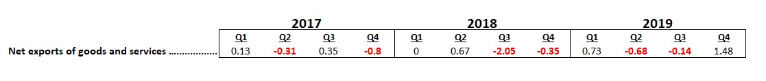
It’s easy to see that this GDP component experiences little consistency. And it clearly had a good quarter. So I could toss out a negative comment like the one from Oxford Economics: “While the average 2.3% GDP advance in 2019 is only marginally weaker than the 2.4% print in 2017, this is yet another optical illusion as the most recent three quarters mark the economy’s worst performance since the 2016 slump.” But I won’t. Each quarter’s GDP number is an aggregation of data from the 4 channels and their numerous sub-components. It’s important to understand how the channels work, but throwing out the results from one channel, simply because they reflect wide variability is — in my opinion — unwarranted.
Frankly, if I was forced to discount, or throw out, one of the 4 channels, I’d select “Government consumption expenditures and gross investment” for the waste bin. Why? Well, this channel measures spending from the federal government, and how much that spending added to (or subtracted from) the GDP figure. In my mind, this silo is less economic than political. “Business” activity does not generate this outcome, our politicians do.
Suppose a politician was interested in boosting GDP performance. By simply increasing the US budget deficit, and spending the borrowed money on stuff on US products like fighter jets or bridges, government spending can directly impact GDP growth. Once again, here are the quarterly contributions from ‘government spending’ using borrowed (deficit) money:
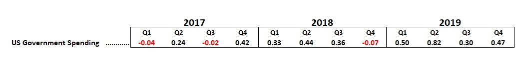
In the past 3 years, government spending has had anywhere from a negligible effect (in 3 of the quarters above) to a rather sizable impact. In fact, if we average the 2019 quarterly numbers, we find that US government spending added .52% to 2019 GDP. Are government spending and GDP growth rates correlated? If borrowing (and spending) a $1 trillion deficit on US “stuff” boosts US annual GDP by about 1/2 percent, can you imagine the impact of $2 or $3 trillion of deficit spending on the GDP growth rate? Perhaps that action could push GDP growth over 3% per annum?
Perhaps. But not without consequence. Newton’s third law of motion is also a foundational economic principle: “For every action, there is an equal and opposite reaction.” No financial or economic condition happens in a vacuum. If the annual deficit were to increase to $3 trillion — meaning total US government receipts were around $3.5 trillion and total spending was around $6.5 trillion — I suspect this could trigger serious adverse financial conditions, such as either meaningfully higher inflation rate or significantly higher US Treasury bond rates, or both. In theory.
It’s hard to say. Because while it’s “been done” in countries such as Venezuela and Zimbabwe, triggering hyperinflation, it’s never happened when the country in question controls the global financial markets, a country like the United States that issues its own currency, which is accepted all over the world. Of course, this is all hypothetical. It could never happen, right?
Or could it? One of the theories making the rounds today, and gaining some traction with the more liberal “progressives” in Washington DC, is Modern Monetary Theory, or MMT. Essentially, MMT suggests that the US can simply print money to pay for whatever it wishes … things like reversing climate change and ‘medicare for all’ … without any adverse financial or economic repercussions. MMT suggests we can print, print, print and spend, spend, spend … and never have a problem. Because since the US has own currency, this theory contends, we don’t have to worry about accumulating too much debt because the FED and Treasury can always print more dollars to pay whatever amount of interest is due. In other words, MMT suggests the US can never have too much debt. No matter how large the debt becomes.
Of course, I vehemently disagree. Sure, I agree the theory could work for the short-term, because of our current position in global finance, but over time I believe such behavior on the part of the US government would debase our currency and trigger hyperinflation. I think the theory is absolutely bonkers. I won’t dive any deeper into the weeds here, but if you’re interested in reading more about MMT, here’s a good Bloomberg article, with worthwhile hyperlinks, for you:
https://www.bloomberg.com/news/features/2019-03-21/modern-monetary-theory-beginner-s-guide
Irrespective of the outcome of the next presidential elections, I seriously doubt MMT, or any similar variation, will ever be implemented in Washington. I’m optimistic there are still more smart people than dumb people in DC. Of course, theories are worth considering, but should the US “bet the farm” on one with so few supporters, inadequate factual support or anecdotal proof, and clear evidence of failure in countries that tried a version of this theory? After all, if MMT was implemented and failed, as I’m sure it would, the US would be bankrupt.
According to the Congressional Budget Office (CBO), we’re already neck-deep in red ink for the coming decade. Per the CBO, our deficit for fiscal year (FY) 2020 will be slightly over $1 trillion. And the ‘deficit’ forecast gets worse from there:
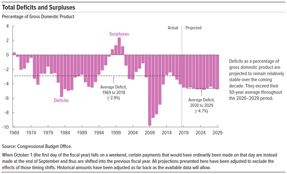
Remember: The CBO “projection” excludes any recession between 2020 and 2029. In fact, the forecast assumes a 2.1% GDP growth rate from 2019 to 2023, decreasing to 1.8% from 2024 to 2029. Apparently, for some reason unknown to me, including a recession (or 2) in their model is beyond their skill set. But if they did, we might see a deficit spike somewhat reminiscent of the 2009-2013 period. (See the chart above.) No, I don’t think the spike would be that bad … but the deficit would certainly larger than the CBO forecast.
The “Average Deficit” predicted above, at 4.7% of GDP each year, translates to about $14 trillion in deficits by 2029. (Remember, US debt is currently around $22 trillion.) Can you imagine the amount of additional debt an MMT program would add? Ugh.
No, I’m afraid MMT is all gristle and no meat. None whatsoever. Unlike the SHI! 🙂
I remain steadfast in my belief that current US economic and demographic conditions limit our annual GDP growth to a maximum of around 2%. And this assumes about 0.50% is contributed to this number by government spending. This is today’s reality. Here’s the good news: A 2% annual GDP growth rate gives the United States a nominal $30 trillion GDP by 2029. At the same time, US population is forecast to grow at about 1% per year (thru 2060), which suggests that GDP per capita (per person) will increase annually. I actually expect US population to grow slower … suggesting GDP growth per person will be even higher … thereby increasing the country’s standard of living. Of course, the financial benefits will likely be distributed disproportionately among the populace, so while this is a generally positive outcome, it may have little effect on the underlying financial inequalities within our system.
By now, you’re probably wondering what all this has to do with high-priced steaks, right?
The SHI is a behavioral economic model. We use human behavior as an anecdotal barometer measuring changes in consumer spending habits, and by extension, for GDP growth as a whole. Foundationally, the SHI is about consumption choice. We all make hundreds of choices every day. By measuring the aggregate of one of those choices — for example, choosing to spend large sums of money for an “experience” more than a meal — the SHI is measuring the week-over-week change in choice, thru the behavior of thousands of people in the 40 expensive eateries we track in 10 different cities across the US. In this way, the SHI is quite dynamic, measuring incremental behavioral changes the CBO forecast, and other similar static models, are unable to include. So while the CBO forecast is both valuable and meaningful, it cannot adapt to rapidly changing behavior or choices of the population. The SHI10 does.
Speaking of which, let’s take a trip to the steakhouses! Are $50 Filet Mignon’s still in high demand at our pricey steakhouses … or is Coronavirus fear keeping folks at home?
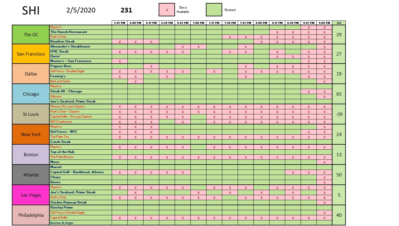
Nope, folks are flocking to the elegant eateries in their local cities and neighborhoods. The steakhouses in Chicago are almost fully booked. Atlanta and Philly aren’t far behind… and reservations in the other cities are in high demand. Well, every city except in St Louis. Looking at reservation demand in St Louis, I’m concerned for the steakhouses. Could the entire city have gone vegetarian? It could happen! But I doubt it. Perhaps the fact that its presently about 30 degrees and snowing is having an impact on reservation demand. Who know. Here’s the longer term trend report:
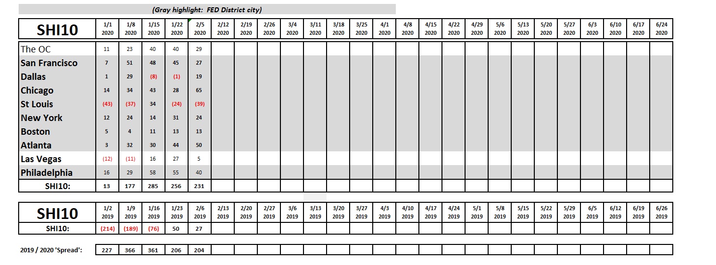
The data since 1/15 has been fairly consistent. Reservation demand in the most expensive steakhouses, where dinner will cost you about $100 per person, are flying off the shelf. Clearly, our consumer is feeling flush and optimistic.
And so is our stock market. As I write this blog, the DOW has passed thru 29,000, the S&P500 has eclipsed 3,300, and both are still rising. Are these moves the result of earnings fundamentals, or might they be reflecting Greenspan’s ‘irrational exuberance?’
Perhaps a little of both. It’s worth noting that the S&P500 “Forward 12-month P/E Ratio” is at its highest level since 2002. Here are comments, and a chart, courtesy of FACTSET:
“On January 17, the value of the S&P 500 closed at a record-high value of 3329.62. Based on this closing price, the forward 12-month P/E ratio for the S&P 500 on that date was 18.7. Given the high values driving the “P” in the P/E ratio, how does this 18.7 P/E ratio compare to historical averages? What is driving the increase in the P/E ratio?
The forward 12-month P/E ratio of 18.7 on January 17 was above the four most recent historical averages for the S&P 500: 5-year (16.7), 10-year (14.9), 15-year (14.5), and 20-year (15.5). In fact, this marked the first time the forward 12-month P/E had been equal to (or above) 18.7 since May 28, 2002 (also 18.7). However, it is important to note that even at 18.7, the forward 12-month P/E ratio was still well below the peak P/E ratio (of the past 20 years) of 24.4 recorded on March 24, 2000.”
Insight/2020/01.2020/01.29.2020_TOW/S&P%20500%20Forward%2012-Month%20PE%20Ratio.png?width=912&name=S&P%20500%20Forward%2012-Month%20PE%20Ratio.png)
I’ll let you decide. But for now, both the SHI10 and I agree: There are no recession threats on the horizon.
– Terry Liebman


