
SHI 1.24.18: The Rate of Return on Everything

SHI 1/17/18: Where is Inflation?
January 17, 2018
SHI 1.31.18: Pirates in China
January 31, 2018
The National Bureau of Economic Research just published a paper entitled, “The Rate of Return on Everything, 1870-2015.” It is a staggering work.
The paper spans almost 150 years and details investment returns in 16 advanced economies. Including addenda, the paper is 123 pages in length. But I have no doubt the research documents could fill a 100,000 square-foot warehouse.
Ready for your own copy? No? Well, then you’ll enjoy this tidbit: I actually paid the NBER $5 for the paper! It’s the first research I’ve actually purchased for the Steak House Index. How could I resist … with a title that compelling? 🙂
Welcome to this week’s Steak House Index update.
If you are new to my blog, or you need a refresher on the SHI10, or its objective and methodology, I suggest you open and read the original BLOG: https://www.steakhouseindex.com/move-over-big-mac-index-here-comes-the-steak-house-index/
Why You Should Care: The US economy and US dollar are the bedrock of the world’s economy. This has been the case for decades … and will continue to be true for years to come.
Is the US economy expanding or contracting?
According to the IMF (the ‘International Monetary Fund’), the world’s annual GDP is almost $80 trillion today.
At last count, US ‘current dollar’ GDP is about $19.5 trillion — about 25% of the global total. Other than China — a distant second at around $11 trillion — no other country is close.
The objective of the SHI10 and this blog is simple: To predict US GDP movement ahead of official economic releases — an important objective since BEA (the ‘Bureau of Economic Analysis’) gross domestic product data is outdated the day it’s released.
Historically, ‘personal consumption expenditures,’ or PCE, has been the largest component of US GDP growth — typically about 2/3 of the total. In fact, the majority of all US GDP increases (or declines) usually result from (increases or decreases in) consumer spending. This is clearly an important metric. The Steak House Index focuses right here … on the “consumer spending” metric.
I intend the SHI10 is to be predictive, anticipating where the economy is going – not where it’s been. Thereby giving us the ability to take action early.
Taking action: Keep up with this weekly BLOG update. Not only will we cover the SHI, but we’ll explore related items of economic importance.
If the SHI index moves appreciably -– either showing massive improvement or significant declines –- indicating growing economic strength or a potential recession, we’ll discuss possible actions at that time.
The BLOG:
Long-time readers of my ‘Steak House Index‘ blog know I follow interest rate movements closely. I believe interest rate levels and movement, here and abroad, offer meaningful insight into a myriad of related and impacted economic conditions or outcomes. For example, when discussing interest rates, the words ‘nominal’ and ‘real’ are used. Nominal, you will recall, is the face rate — the rate paid or received by the contract or agreement. The ‘real’ rate, on the other hand, is the contract rate minus the current inflation rate. Thus, the ‘real’ rate is the inflation-adjusted rate paid/received. And since the rate of inflation is volatile, the real interest rate is the one economists typically discuss and compare in economic analysis.
Which means inflation rates play heavily into contract interest rates — the rate you or I pay when we borrow money. If the inflation rate increases meaningfully, nominal interest rate increases will be close behind. But it’s not only the actual inflation rate that impacts interest rates; expected or anticipated inflation can move rates higher or lower, as we saw in last weeks blog where we discussed the “break even rate” of interest.
Yes, all of economics is a puzzle within a conundrum within a complexity. 🙂 Fun!
Long-time readers also know I harbor strong opinions about the future of real interest rates. Why? Because I feel conventional wisdom is wrong. Conventional wisdom suggests the current ultra low level of rates cannot last. That very soon, both short- and long-term ‘real’ interest rates will move to appreciably higher levels.
I don’t agree. I understand how many folks may have come to that conclusion. Beginning in the mid 1970s — and for decades thereafter — both real and nominal rates rose significantly. Thus, using the the past 40 or so years as the lens thru which to predict future rate levels suggests that with rates now at historic lows, all rates should soon rise again. Effectively reverting to the mean, so to speak.
But I feel this perspective is inaccurate because the source data is too short in duration. Based on my personal research, for years I’ve felt conventional wisdom ignores many centuries of rate data. But for good reason: The data was incomplete and questionably accurate.
But now, with the amazing NBER research paper in hand, “The Rate of Return on Everything,” spanning 16 countries over almost 150 years, we now have phenomenal data upon which we can base and forecast future interest rate levels.
Five authors, from academia, the Federal Reserve, the Bundesbank in Germany and the University of Bonn researched, collected and reviewed a mountain of data from 16 advanced economies and wrote this amazing paper. I’m serious when I say if you’d like a copy, send me an email request and I’ll forward it on.
In the introduction, the authors comment:
“We have painstakingly compiled annual asset return data for 16 advanced countries, over nearly 150 years. We construct three types of returns: investment income (i.e., yield), capital gains (i.e., price changes), and total returns (i.e., the sum of the two). These calculations were done for four major asset classes, two of them risky—equities and housing — and two of them relatively safe — government bonds and short-term bills. Along the way, we have also brought in auxiliary sources to validate our data externally. We also follow earlier work in documenting annual equity, bond, and bill returns, but here again we have taken the project further.
We re-compute all these measures from original sources, improve the links across some important historical market discontinuities (e.g., closures and other gaps associated with wars and political instability), and in a number of cases we access new and previously unused raw data sources. Our work thus provides researchers with the first non-commercial database of historical equity, bond, and bill returns, with the most extensive coverage across both countries and years, and the evidence drawn from our data will establish new foundations for long-run macro-financial research.”
Wow. This report is impressive by scope alone. But, of course, the paper offers some amazing insights and conclusions. Here are two I found the quite compelling:
- Over the past 145 years, across the globe, the ROI from housing has actually surpassed the ROI from equity investments.
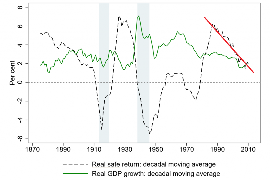
- The real ‘safe’ return — the return the most risk-averse investors seek (in excess of inflation) — has often been negative. And post-OPEC Oil Shock (late 1970s), has resumed it’s downward direction. Take a look at the black line below:
It’s important to note that “housing” in this context is residential rental property. Rental income is a meaningful contributor to the overall ROI. So while buying a home — for personal use — is a good idea, the returns on housing were higher than equities partially due to the rental income generated. It’s also important to note that this outcome is across all 16 countries, collectively. Here in the US, the total return on equities beat the return from housing. The nominal average annual return from equities was 11.08% vs. that of housing at 8.87%.
I added the red line in the graph above for context. Both the black and green lines are a 10-year moving average.
You can see the black line has been trending down since the late 1980s. Possibly even more interesting, the ‘safe’ return has been negative in many, many prior years: Look at the sections of the graph where the dotted black line is below zero. In fact, with the exception of the last 50s to the late 60s, the ‘safe’ return was negative for almost 50 years!
What does this data tell us?
That the negative returns sovereign bond holders accepted in the past 4 or 5 years are not unusual. Negative real returns are quite common throughout history. In fact, if we take the Great Depression and the OPEC Oil Shock out of the picture, the ‘safe’ yield has typically been negative. Remember, this analysis covers almost 150 years over 16 advanced economies.
Here’s a chart from the paper that shows the real (inflation adjusted) ROI on ‘safe’ investments:
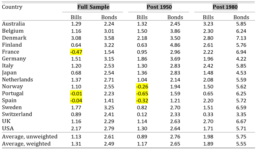
I added the BOLD and gray over “Full Sample,” “Post 1950,” and “Post 1980.” I also added the yellow highlights.
Note the matrix refers to ‘Bills’ and ‘Bonds.’ A Bill is a government security with a short-dated maturity, typically 3-months, but no longer than a year. Bonds refers to debt instruments with a maturity of greater than 1 year.
Again, let me summarize with these comments:
- The “Full Sample” is the period from 1870 to 2015 — 145 years. Meaning, on the average, over the past 145 years, the short-term ‘safe’ return accepted by investors in France, Portugal and Spain was negative.
- Since 1950, investors in Norway, too, have been willing to lose money on short-term sovereign debt investments.
- Finally, for 145 years, Switzerland, Japan and Finland, too, have successfully paid out less than a 1% return to investors in short-term instruments.
Remember, a negative return means the investor is willing to lose a small amount of principal during the investment duration in order to keep their investment ‘safe.’
These findings are amazing because they suggest our collective experience in the past 30 or so years is not the norm but the aberration. We have all be conditioned by the markets to expect US interest rate to return to their lofty levels seen in the prior decades. But apparently, those lofty levels are not the norm. The matrix above proves this fact: Post 1980, the real (inflation adjusted) ROI on US Treasury Bonds averaged 5.71%. But including this period in the calculation, over the “Full Sample” of 145 years, the return averaged a much lower number, 2.79%. While I don’t have the data to calculate the “Pre-1980” ROI, I suspect that ROI number would be in the low 2% range.
Meaning, if the ‘safe’ return wasn’t still sliding, we would expect long-term rates to settle in about 2% above the rate of inflation. But as we see above, the ‘safe’ return IS continuing to fall. And the lower it goes, the lower the ROI ‘safe’ investors will accept on their investment. Perhaps, if history is an accurate barometer, even a negative ROI.
We can’t know where the future ‘safe’ return will settle in. We can’t know how or if current economic and demographic conditions will push the expected ‘safe’ return even lower. All we can say with a high degree of certainty is this: Unless inflation surprises us all and comes back in a big way, across the 16 developed nations in this study, short and long term interest rates are likely to remain very low when compared to those we experienced in the past 30 years. Do NOT expect rates to rise to the levels seen 10 or 15 years ago. The data simply does NOT support such an outcome.
OK…let’s take a break and head to The Steak House!
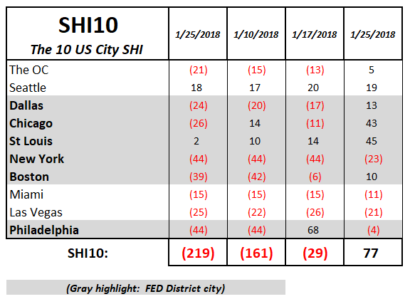
This week blistering hot steaks are back in vogue: The SHI10 is a positive 77. In fact, this is the first week in 2018 that the SHI10 been positive. Take a look at this week’s SHI10 summary:
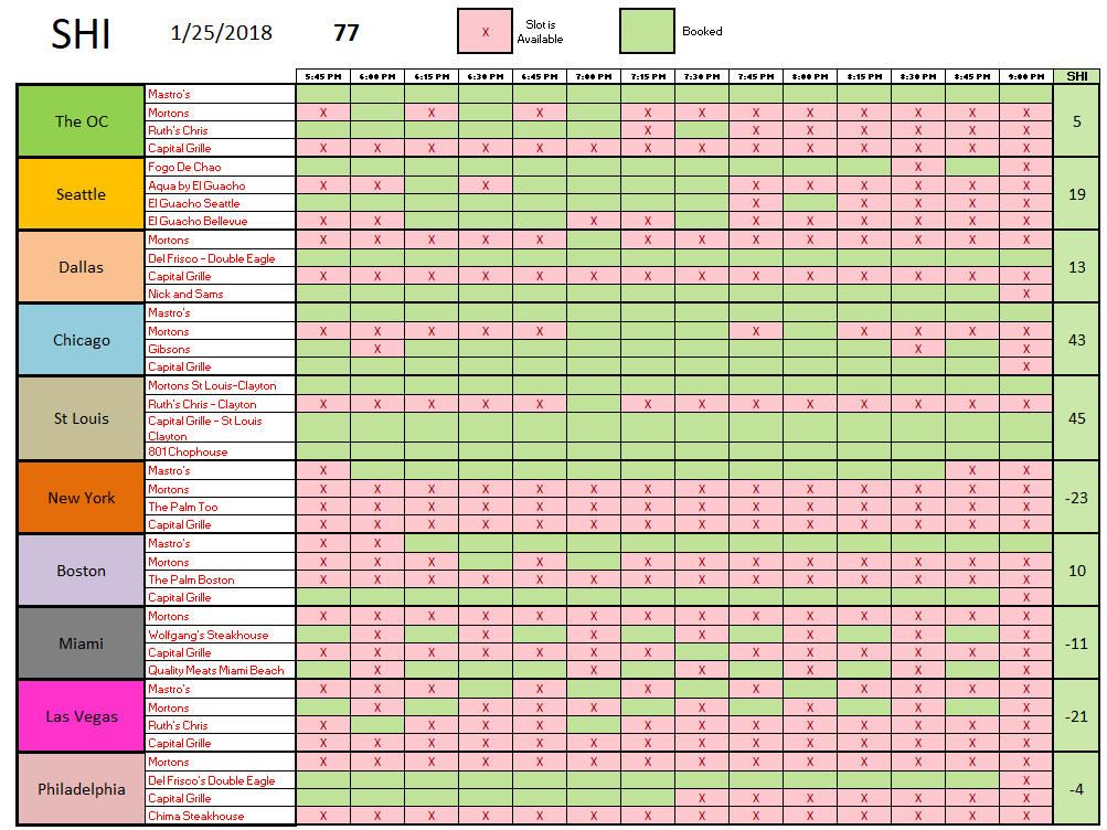
I find this really interesting: Restaurant popularity seems to vary by city. Take the Capital Grille, for example. For years, it’s been the “dog” here in the OC. The same looks to be true in Dallas. But in St. Louis? Nope … once again, the Capital Grille is fully booked this Saturday. And the same in Chicago.
Mastros seems to enjoy the most universal popularity … but not in ‘Vegas. Once again, NYC has plenty of open tables … but this week Mastros is about half booked. Here’s the entire SHI10 grid:
Once again, St. Louis is leading the pack with an SHI reading of 45. Impressive. NYC, again, is at the other end of the spectrum at a negative 23. But across all markets, this is a better week for steaks and baked potatoes. Come and get it!
- Terry Liebman


